Visual identities that work
Your brand is the impression people hold of your organisation. Visual identity is a vital tool to shape that impression. At Bureau Bureau a lot of our work focuses on creating strategy-driven visual identities. Using design as a tool, we help organisations around the world communicate who they are and achieve their goals.
Before commissioning a visual identity, it’s important to know what it actually encompasses and what it could unlock for your business. This piece covers the value and scope of a thoughtful visual identity.
Take control of your brand
A throwaway logo and default font choice aren’t neutral. They say ‘we haven’t figured out who we are yet’ or ‘we don’t think this matters’. Visual choices that aren’t aligned to messaging dilute your brand’s impact and leave audiences unsure of what you stand for. They may cause you to be overlooked in favour of competitors who look more coherent and confident.
You can’t opt out of communicating visually. The moment a brand exists it’s saying something – people draw immediate conclusions from type, colour, layout, and minor design details.
Get your visual identity right and it will open doors and build trust for you – signifying competence, authority, sophistication, or whatever you need to make the right impression.
Use visual identity to your advantage
A thoughtfully created visual identity is a strategic advantage for your organisation. It helps people identify, recognise, and trust you. It makes it easier for customers, partners, and investors to choose your organisation. It also brings internal teams into closer alignment.

It identifies you (fast)

It creates recognition (over time)

It makes your strategy visible

It creates internal alignment
Look beyond the logo
Ask non-designers what a visual identity is and many will say it’s the logo. The logo is crucial, but it’s only one piece of a much larger toolkit. On its own, Apple’s logo doesn’t say ‘easy to use’ or ‘premium’. Those attributes are conveyed through the wider identity system: the minimal packaging, clean image compositions, immaculate stores, smoothly curved hardware, and consistent visuals across every touchpoint.
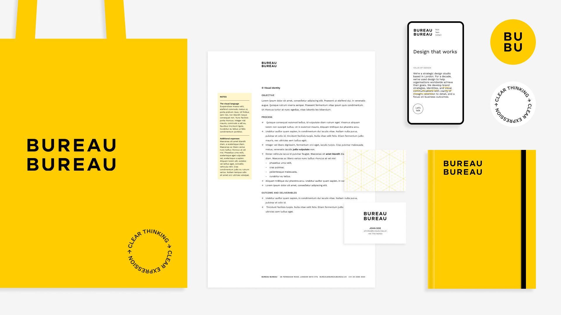
An effective visual identity isn’t one almighty mark, it’s a set of decisions that work together: logo, typography, colour, layout, imagery, motion, materials, and more. The more coherently these decisions are applied, the more clearly an organisation can shape the impression it leaves. Here are the core components of a visual identity system:
The logo, mark, or wordmark
This tends to be the part that people remember and recognise fastest – the thing that sits in the corner of a website, on a proposal, or on a product. A logo doesn’t need to explain everything. It just needs to be distinctive, memorable, and appropriate to the organisation it represents.
As Paul Rand argued, a logo derives its meaning from the quality of the thing it symbolises, not the other way round. In other words, the mark itself can only do so much. A great mark makes the organisation’s value easier to recognise, remember, and trust. Over time, it becomes a shorthand for everything people have experienced of the organisation: its products, service, behaviour, communication, and reputation.
Used consistently, a logo helps people quickly recognise who something is from. When the organisation delivers, the mark gathers value, building familiarity, credibility, and trust.
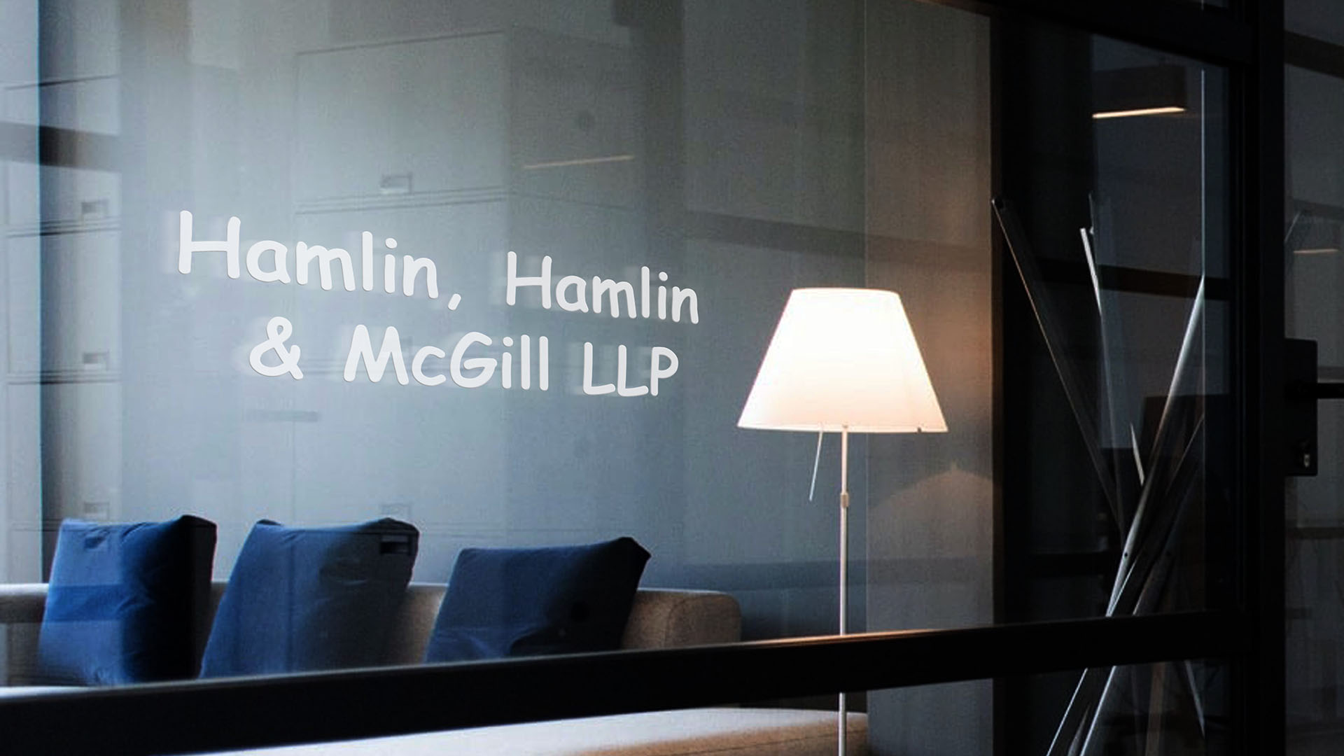
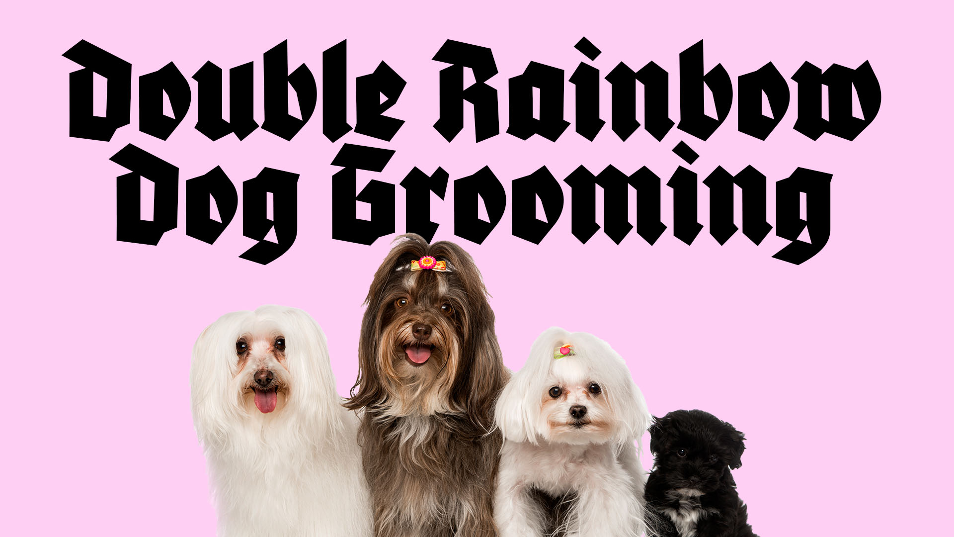
Typography
Type is an often overlooked component, even though it can achieve so much with very little. The typefaces you choose not only determine usability, but set the tone of the entire identity system.
The subtleties of typographic choices may seem arcane but we are all susceptible to their effects. A precise, tightly spaced sans serif feels very different to a high-contrast, generously spaced serif. One may signal modernity, while the other can suggest luxury or heritage. The type choices you make should reinforce the message of the words you’re using. Would you trust a law firm using Comic Sans with your business?
The choice of typefaces, how they’re combined, and how they’re implemented can determine how your message lands.
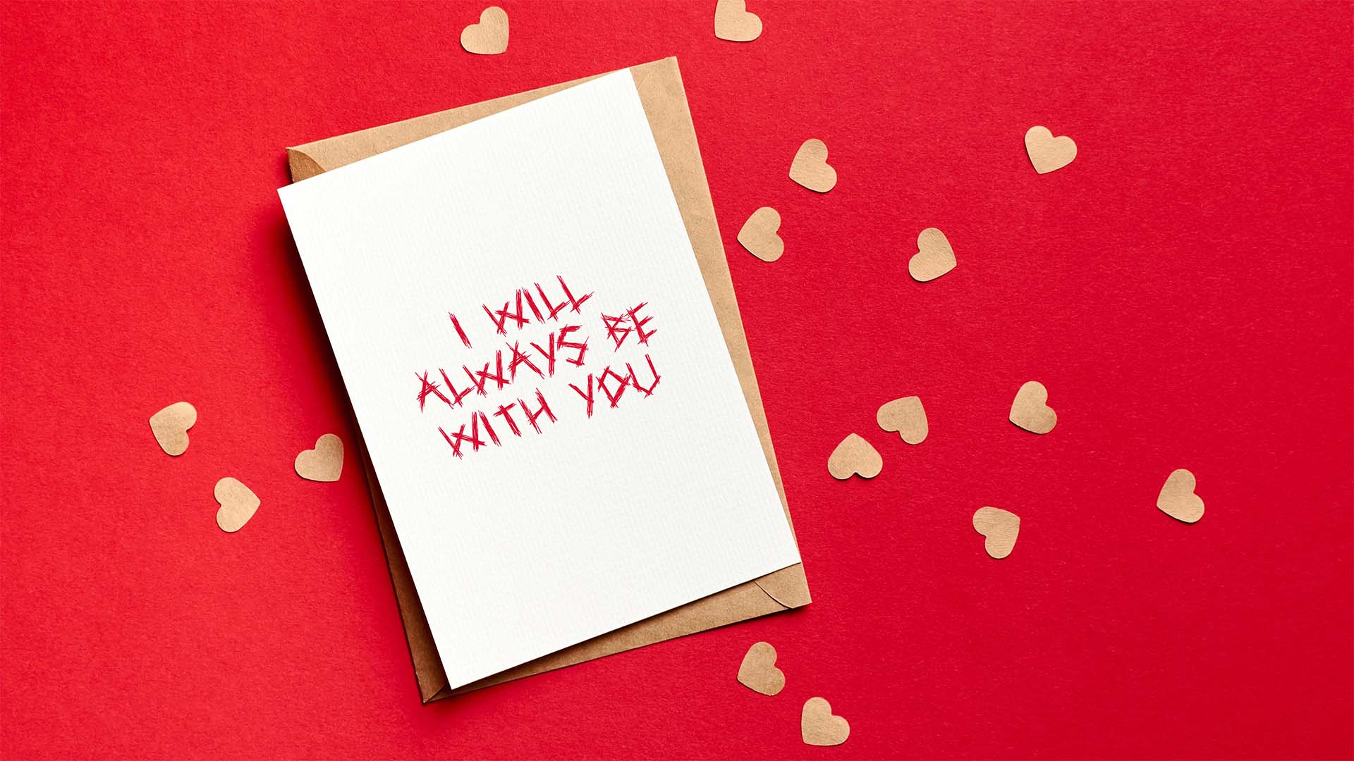
Colour Palette
Colour is often the fastest emotional cue. A good palette is built around the signal it needs to send, not personal preference. Pastels feel calm, neons feel energetic, and jewel tones can suggest luxury. The key is choosing colours that align with your positioning and don’t get lost in your category.
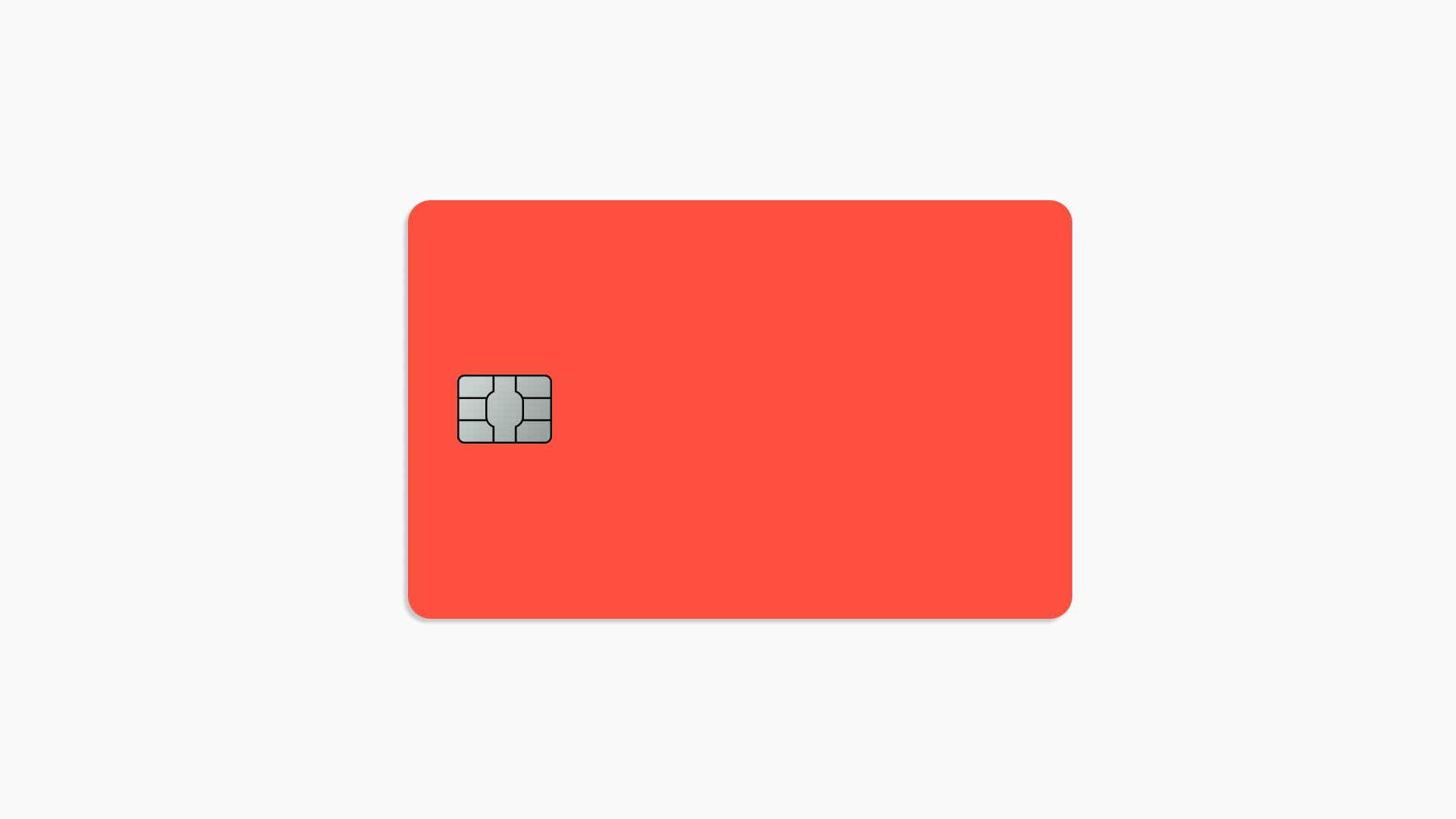
Understand the expectations of your audience, and subvert them when appropriate. When Monzo’s hot coral cards launched, the colour alone said: this isn’t a normal bank. Traditional banks were using conservative blues and neutrals to signal trustworthiness, so Monzo’s coral marked them as a challenger and made the card itself a conversation starter.

Motion
As brands increasingly live across websites, products, presentations, social feeds, and event screens, motion has become a key part of visual identity. It can appear in many forms: animated logos, hover effects, micro-interactions, data animation in decks, event screen backdrops, launch films and more.
Motion can add expression and energy in a way that static design isn’t always able to. As digital touchpoints proliferate it’s becoming a key tool to prevent your identity from looking stale. At Bureau Bureau we experiment with motion in the very early stages of the identity development process, and allow it to lead us in unexpected directions.
Layout
Layout determines how elements relate to each other, guiding the viewer’s eye and affecting how information is delivered. It creates hierarchy, controls pacing, and influences how a piece of communication feels. Generous white space can signal confidence and clarity; dense layouts can suggest energy, richness, or complexity; strict grids can convey rigour; looser compositions can create a sense of movement or play.
The amount of white space, density of content, rigidity of the grid, and balance between text and images can all be used to support your messaging and set you apart. Crucially, good layout design makes information easier to scan and understood. When codified in templates and made repeatable, thoughtful layout rules are an under-appreciated way to signal consistency and attention to detail.
Follow an intentional process
There are many ways to approach a visual identity project. After ten years of refinement, we have developed our preferred process, outlined below. It helps us design with the ultimate goals of the organisation in mind, ensuring the identity performs as a valuable business tool rather than just a coat of paint.
➀ Discovery
We understand the context, goals, and constraints through interviews, workshops and desk research.
➁ Positioning and messaging
We then develop a positioning statement and messaging principles to guide communication. These also act as helpful tools when it comes to evaluating the visual work.
➂ Directions
From there we create a small set of design directions, each rooted in the positioning and messaging but with a distinct strategic emphasis. These are stress-tested through mockups of the real world touchpoints that matter most.
➃ Refinement
We use feedback to move into refinement – tightening the selected direction and creating a robust system that holds together across the details.
➄ Applications
Then we build out applications like pitch decks, websites, and billboards. We also create templates and written guidelines so internal teams can create visually consistent designs as the need arises.
➅ Evaluation and ongoing work
Our work doesn’t end on delivery of ‘final’ assets. We like to build close relationships with our clients – maintaining ongoing stewardship of the identity to work out any kinks and to make sure the system evolves appropriately as the business grows.
Benefit from our experience
As a brand you have no choice but to communicate visually, and it pays to be strategic about how you do it. When built intentionally visual identities are business tools that can move you towards your goals by helping people recognise, understand, and trust you. At Bureau Bureau, we have ten years of experience creating visual systems that don’t just make organisations look good, but that help them move forward with clarity and confidence. If you’re preparing to launch a new brand or rethink your current one, get in touch.