Pitch decks that work
One of our strengths at Bureau Bureau is building strong pitch decks for early-stage companies. We’ve helped our clients raise almost $500 million by showing them how to structure and present their ideas with clarity.
Founders routinely waste their one chance at a first impression with avoidable mistakes. Here then, drawn from experience, are practical ways to build a pitch deck that engages investors.
Great pitches open doors
A humble set of slides can lead to building a legendary company. The 2008 Airbnb deck was spare and to the point. It didn’t predict a trillion‑dollar category or dazzle with motion graphics. It made a simple, compelling case: there is a real problem, people already hack around it, and here’s a better way to address it that’s growing fast. That clarity got them the conversations that mattered.
With much at stake, founders agonise over their decks. They sweat every detail, stress about their numbers, and rewrite obsessively. That effort is often ineffectual. Over-polishing drains the life out of the story, obscures the message, and eventually loses attention.
Keep the goal in sight: A pitch deck’s job is not to ‘win the round’ in one sitting. It is to open doors and create momentum. Done well, your deck makes it easy to say ‘let’s keep talking’. Done poorly, it creates friction that could derail your ambition.
To keep the conversation going, your deck needs to do three things: show your mettle, tell a clear story, and be cogent by design.
Your deck speaks for you
‘Good ideas and good products are a dime a dozen. Good execution and good management – in a word, good people – are rare.’
Arthur Rock ↗︎
A prime objective of your pitch deck is to make investors believe in you.
Great ideas come easy. Turning a concept into a thriving company is truly difficult. The idea, the patents, the market size, and the roadmap are very important, but investors have seen what happens to the best laid plans. So, instead of gambling on doubtful predictions, they bet on people.
For investors pitch decks are a proxy for how you think, plan, and execute, so use your deck to demonstrate your skills and tenacity. Be truthful about your competencies as well as areas where you need support.
Exemplify strengths
Where possible, show, don’t tell. Tune the content and presentation to manifest your abilities.
- Are you great at cutting through noise to get to the signal? Explain the problem and your solution with clarity, brevity, and precision.
- Are you an excellent collaborator? Describe how you can amplify your advantage through collaboration.
- Do you have a bias to action, moving with great momentum? Plot your swift progress on a timeline.
Be open about weaknesses
Build trust by showing awareness of your weaknesses instead of sweeping them under the rug. Mention how you will compensate for them.
- Do you have a blind spot that could affect your mission? Demonstrate you are taking steps to validate your assumptions.
- Do you lack sales or operational experience? Talk about who you are approaching to help.
- Are you not a great communicator? Well, you could ask for our help. Or read on.
Reflect your priorities
How you present can reveal what’s important to you. Match that to what is important for your venture, and make sure the medium does not undermine the message.
- If your product depends on great design, don’t show up with unconsidered layouts and style choices. The deck should embody taste and judgement.
- If speed and decisiveness are core, avoid long-winded explanations. Keep your story tight and pithy, with unnecessary embellishment stripped away.
- If rigour matters, don’t be careless with your language and layouts. Every slide should be perfectly honed: verbally and visually consistent, error-free, and precise.
Show commitment
Finally – and crucially – investors need to know that you have the drive to see this through, that you will be able to inspire your team, and that you will persevere through the difficulties in your path. Show your passion and commitment in every slide.
Clear narratives win attention
‘The money flows as a function of the stories.’
Don Valentine ↗︎
Most investors read far too many decks in too little time. On average, they spend only a few minutes per deck, often skimming for the spine of the story and the signals that matter. Make that skim effortless. Even if you get to walk investors through your pitch, the narrative has to be compelling and easy to parse.
Lead with the takeaway on every slide. Keep a single thread that a tired brain can follow at 11 pm. If a detail doesn’t advance the case, cut it. The test is simple: could someone understand your business and why it will succeed by reading only your slide headings and a few captions?


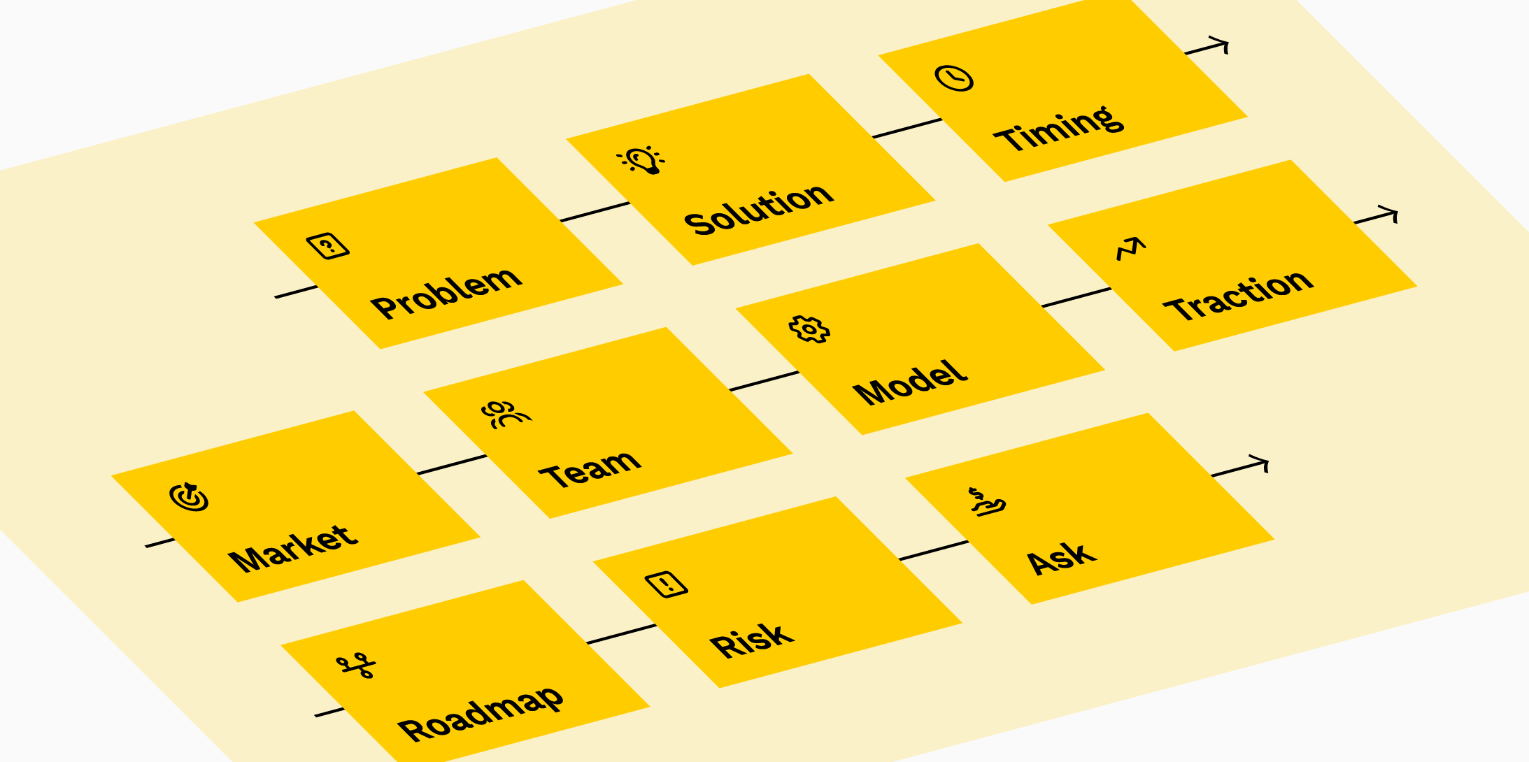
A narrative template
Here’s a practical backbone to build that kind of deck. Adapt this to your needs by adding, omitting, or combining slides. Use your own language, keep each slide to one idea, and make the headings do the heavy lifting.

1. What this is

2. The challenge

3. The solution

4. Now is the right moment
5. The market we can win

6. The right team

7. The business model
8. Traction so far

9. How we get from here to there

10. What could go wrong

11. What we’re raising and what it unlocks
Design shapes understanding
‘Design is how it works.’
Steve Jobs ↗︎
Visual presentation is not about decoration – it’s how you remove cognitive load. Clarity should always take priority over clever gimmicks. Your slides should communicate the core ideas quickly without needing further explanation.

- Keep it simple. Choose a clean and legible typeface and stick to it. Use generous margins and comfortable line lengths. Generous blank space can help focus attention where it’s needed.
- Headings should carry the takeaway. If someone only reads the headings, they should still understand the story. Structure the hierarchy of information on each slide in two or three levels: a heading, a visual, a short paragraph.
- Use just enough text to explain the point. Dense paragraphs are speed bumps. Aim for short, declarative sentences and supportive visuals.
- Resist ornament. Over‑designed decks more often distract than persuade. Let the content do the work.
- Be visually consistent. Use grids or alignment guides, pick a restrained colour palette, and keep data styles uniform. Inconsistency impedes quick parsing and reads as carelessness.
- Make important numbers easy to notice and understand. Use charts only when they clarify. Label your axes. Prefer relative comparisons over tables full of numbers without context.
- Show product images sparingly and purposefully. One screenshot that proves ease of use is better than a collage of UI layouts.
- Test in the wild. View your deck on a laptop, a projector, and a phone. Export to PDF and check the file size. Nothing kills engagement like a 90 MB attachment or unreadable text on an iPad screen.
- Proof like a professional. Typos, mixed punctuation, misaligned boxes, and bad images are easily avoidable visual distractions. Remove them.
If in doubt, default to undecorated, matter‑of‑fact slides. A deck with ill-considered attempts at elaborate layouts will likely fare worse than a crisp, austere one. Aim for invisible design: nothing but content should call attention to itself and every element on the slide should advance the message.
Fresh eyes find gaps
Being close to your venture creates blind spots. You can easily rely on assumptions that aren't explicit in your deck, missing gaps that will confuse investors. Before sharing with investors, test your deck with colleagues, non-experts, and friendly investors. Walk them through as you would in a real pitch, then ask if they could follow the thread, what felt unclear, and what questions remain.
Pay attention to where they ask for clarification. Those moments reveal gaps in your narrative or unstated assumptions. Note recurring questions and pre-empt them in the deck or your delivery. Use this feedback to tighten your story, add missing context, and strip out distractions. Each practice run sharpens your pitch and makes it worthy of your ambition.
Benefit from our experience
This advice is straightforward but can be challenging to implement. At Bureau Bureau, we have ten years of experience helping founders distil complex technical visions into compelling and clearly delivered narratives. We work collaboratively to identify the story that matters, structure it for maximum impact, and present it with the right tone.
Our clients meet their funding targets not because we embellish their decks for them, but because we help them articulate what makes their vision worth backing. If you’re preparing to raise and want support on both substance and presentation, get in touch.


Further reading
Y Combinator: How to Build a Great Pitch Deck
Y Combinator: Pitch Your Startup
Sequoia Capital: Writing a Business Plan
Guy Kawasaki: The Only 10 Slides You Need
Guy Kawasaki: The 10/20/30 Rule of PowerPoint
Dropbox × DocSend: How to create a pitch deck that will wow investors
Ros Atkins: The Art of Explanation